How to Build the Navigation Bar and User Authentication Using Momen
In this tutorial, we'll walk through building a navigation bar and implementing user authentication for an online course platform using Momen. This guide is designed to help you understand the layout and functionality needed to create a clean, responsive top bar with login and signup capabilities. We'll cover inspecting the webpage layout, setting up the navigation bar, and creating login and signup modal dialogs with validation.
Understanding Webpage Layout
Before diving into building, it's essential to understand how web pages are structured. We use Udamy's homepage, an online course platform built with Momen, as our example to analyze the layout. By inspecting the page with Chrome's debugging tools, you can see how different sections are arranged visually and structurally.
Web pages initially display simple text from top to bottom, but as designs become more complex, layout engines like Flexbox manage spatial arrangements. Flexbox allows elements to be arranged either horizontally (left to right) or vertically (top to bottom), which covers most layout needs.
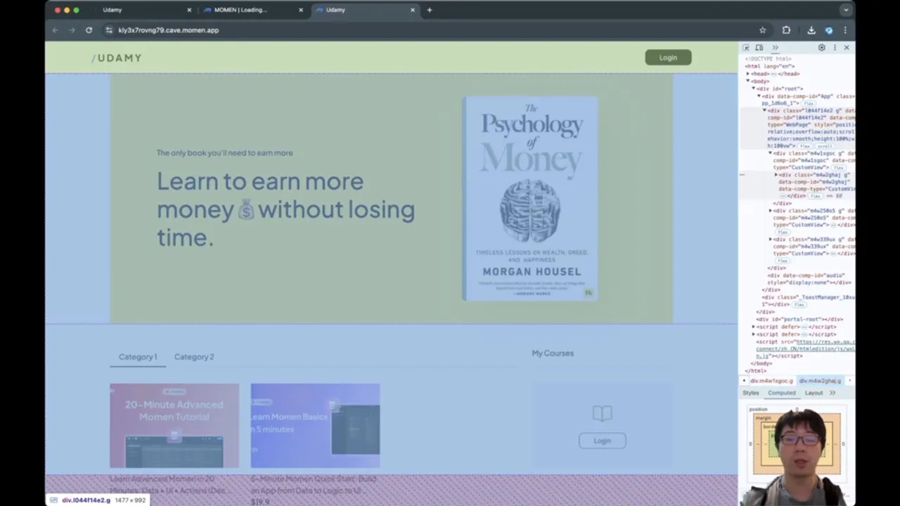
For example, the top bar is a horizontal box, with the logo on the left and the login button on the right. Below that is the "hero" section with a yellowish background that encourages learning for better earnings. Further down is the main section containing categories and course listings, arranged in a mix of vertical and horizontal boxes.
Understanding these boxes and their directions (left-to-right or top-to-bottom) is key to replicating a similar layout. For instance:
The top bar is laid out horizontally (left to right).
The hero section is split left to right: the left side is vertical (top to bottom) content, and the right side is a single image.
The main section also uses horizontal layout, with nested vertical lists for categories and courses.
Each course item is a vertical box with an image on top and title and price below.
Setting Up the Project and Top Bar
Let's start implementing the top bar in Momen.
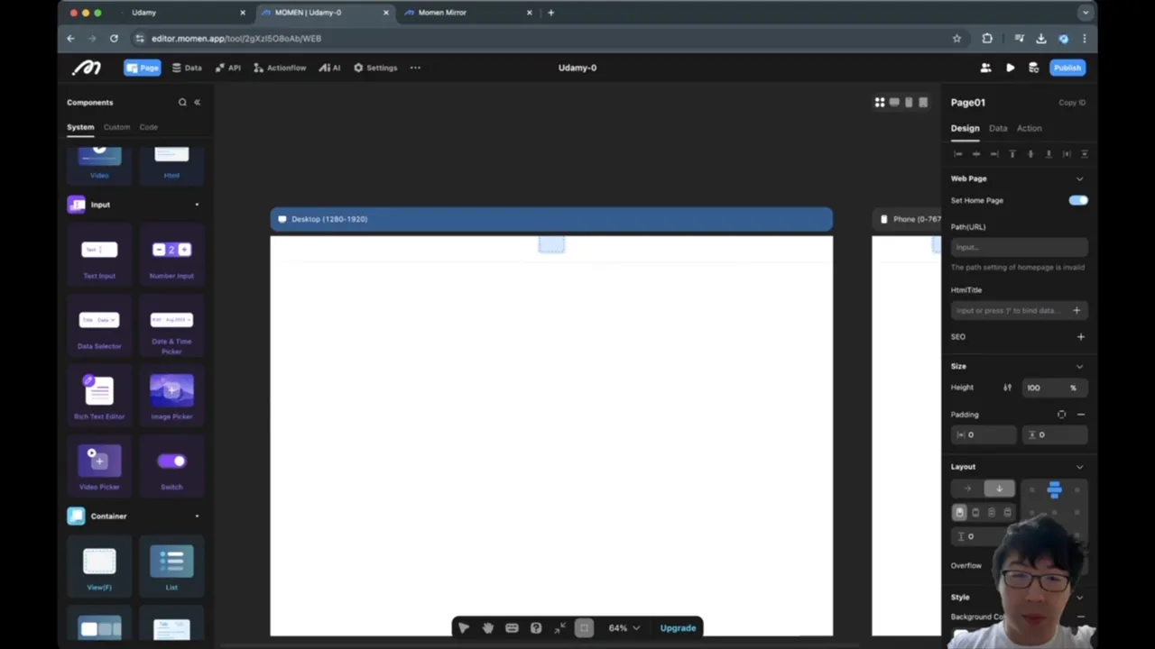
Create a new project and name it.
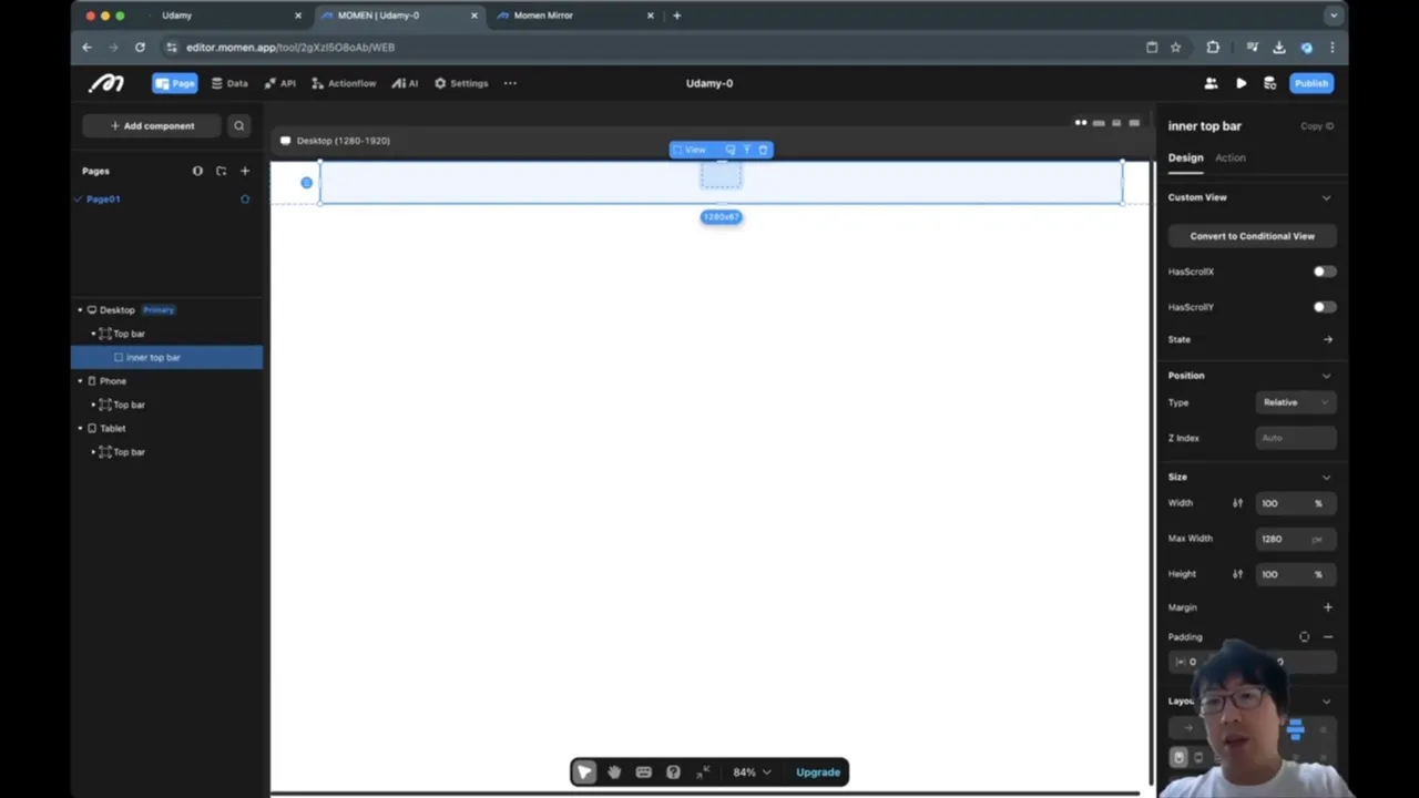
Begin by adding a View component that will act as the entire top bar.
Set the width to 100% to span the full screen width, and fix the height to 68 pixels.
Add a bottom border to separate the top bar visually. Use a subtle gray color (#e4e4e7) for the border.
Remove any background color from the top bar to keep it transparent.
One important detail is positioning the top bar so it stays fixed at the top of the viewport even when scrolling. Set the position property to fixed, which anchors the bar relative to the visible window, preventing it from scrolling away.
Adding Inner Container for Max Width and Padding
To prevent the top bar from stretching too wide on large screens, add an inner view container inside the top bar view. This inner container will have:
Width set to 100% of its parent.
Maximum width capped at 1280 pixels.
Padding to create spacing on the left and right sides (typically 10 pixels).
Padding is the space inside a container that its children cannot occupy, while margin is the space outside a container that separates it from siblings. Adding padding to the inner container ensures the content does not touch the edges of the screen.
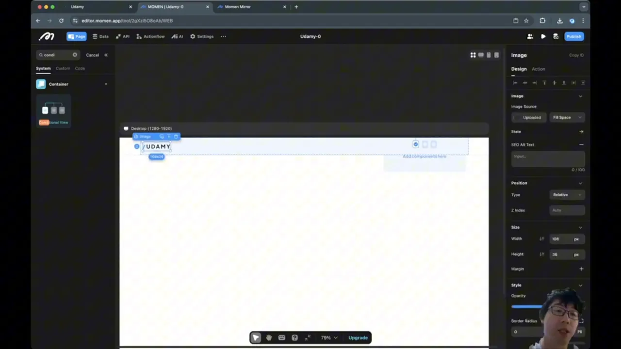
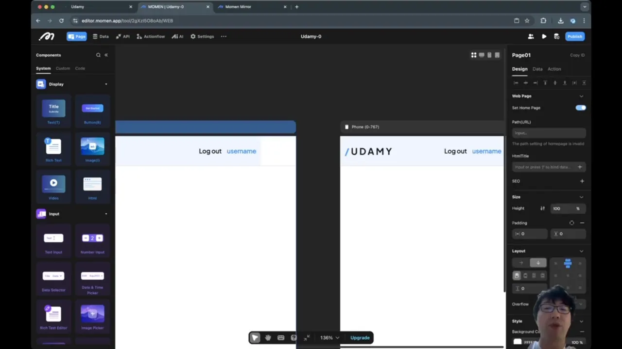
Adding Logo and Conditional Login Button
Inside the inner container, add the logo on the left and a conditional login/logout section on the right.
Upload and insert the Udemy logo image. Set its size to fixed width 108px and height 35px to maintain consistency.
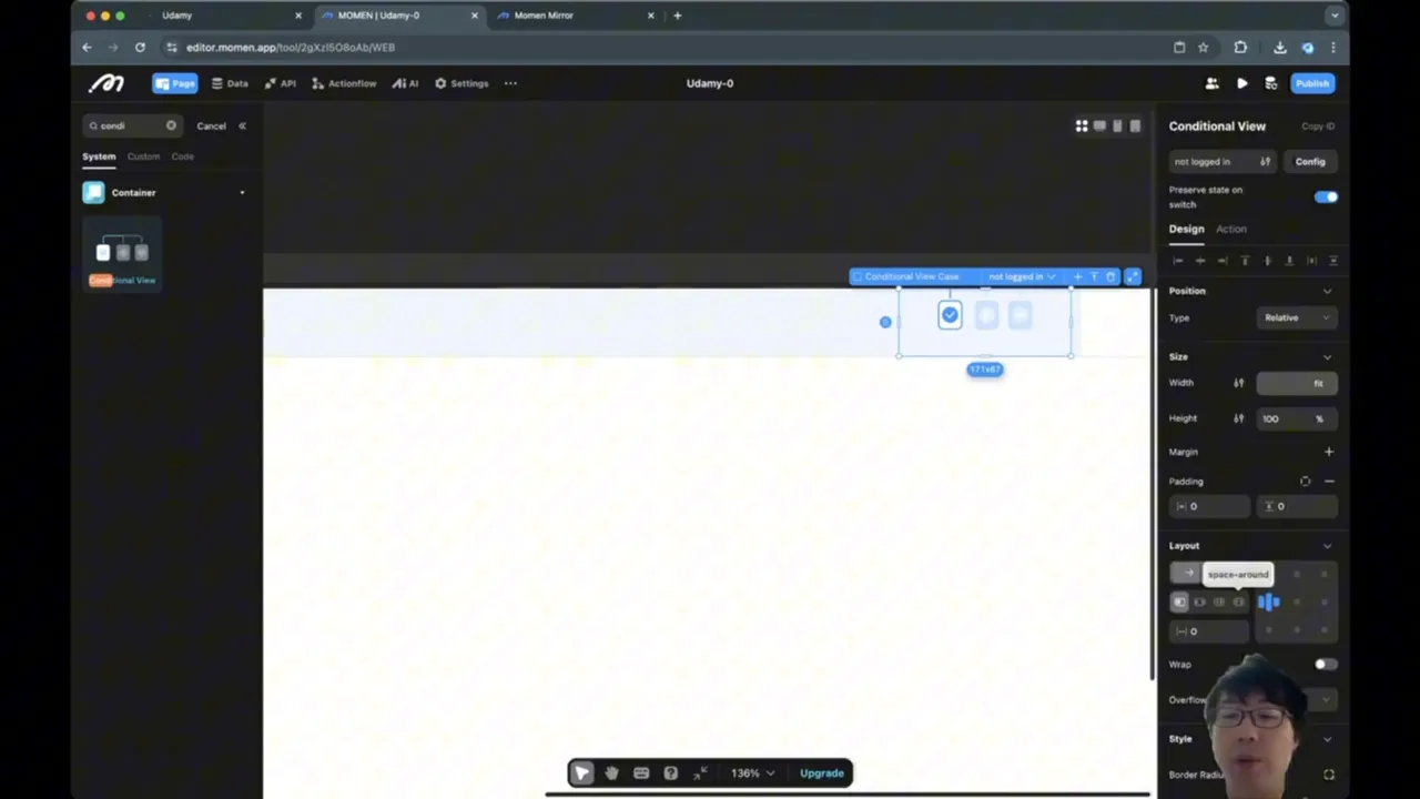
Add a Conditional View on the right side, which will display different UI elements depending on whether the user is logged in or not.
Set the layout direction of the inner container to horizontal (left to right) and use space-between alignment to push the logo and login/logout to opposite ends.
Configuring the Conditional View
The conditional view will have two cases:
Not Logged In: Show a login button.
Logged In: Show the username and a logout button.
Set the width of this conditional view to fit its content, with height 100% of the parent container.
Designing the Login and Logout Buttons
For the logged-in state:
Add a button for logout with a fixed width of 100px and height 34px.
Use a dark background color (e.g., #818181) for the button.
Center the button content vertically and horizontally.
Add the username as text next to the logout button, styled with a medium-weight font and a bluish color (#1598FF) for visual distinction.
Add a gap of 12 pixels between the username and logout button.
For the not logged in state, simply show a login button styled similarly.
Implementing Login and Signup Modals
To enable user authentication, add modal dialogs for login and signup. These modals block interaction with the rest of the UI and can be dismissed by clicking a close button or outside the modal.
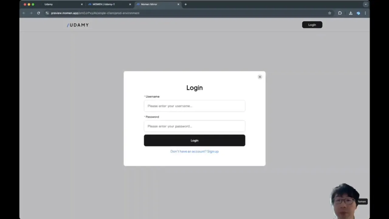
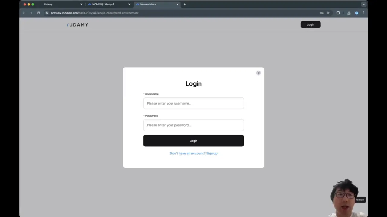
Creating the Login Modal
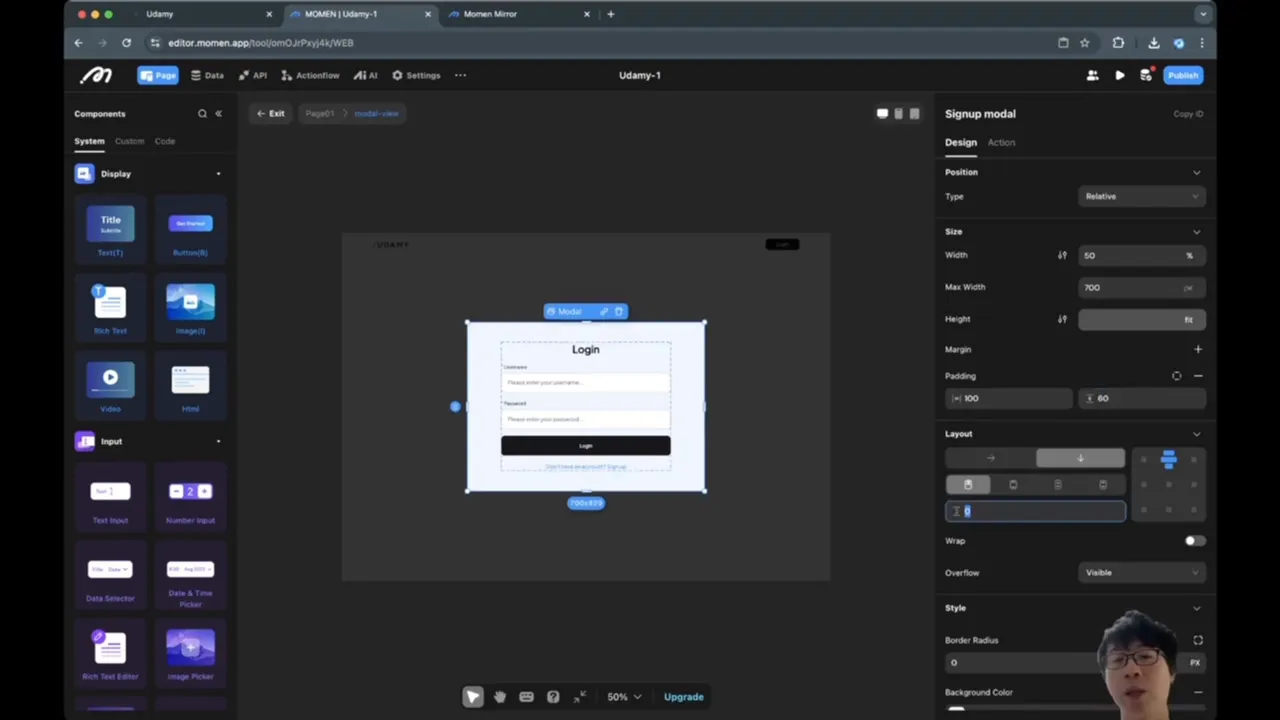
Add a new custom layout modal named login model.
Add a close button (a small circle with an 'X' image) positioned absolutely at the top-right corner of the modal.
Set the modal width to 50% of the screen with a maximum width of 700px.
Make the modal background fully white and add rounded corners with a 10px border radius.
Add a large "Login" title text with font size 30 and medium weight, and add padding around the modal content to space it nicely.
Create labeled input fields for username and password, each with a star (*) label indicating required fields.
Style the input boxes with fixed height (58px) and full width inside their container.
Add a login button below inputs, styled with the dark background color used earlier and fixed height 58px.
Add a "Don't have an account? Sign up" link below the login button.
Login Modal Interaction Details
The close button hides the modal when clicked. The login button triggers the login action with the username and password inputs passed as parameters.
If login fails (wrong username or password), show a toast notification with "Login failed". The password input should be set to password type so characters are hidden.
Creating the Signup Modal
Duplicate the login modal and rename it signup model.
Adjust the title text to "Sign up".
Add an extra input field to re-enter the password for confirmation.
Rename inputs appropriately to distinguish from login inputs (e.g., signup username input, signup password input, signup password reentry input).
Remove the "Don't have an account" link since this is the signup modal.
Keep the same styling and layout as the login modal.
Signup Validation Logic
Before allowing signup, validate that:
Username is not empty.
Password is not empty.
Password and password reentry match.
Password length is at least 8 characters.
Use the conditional action to check these conditions. If valid, proceed with signup action passing username and password inputs. If invalid, show a toast with "Bad entry for sign up".
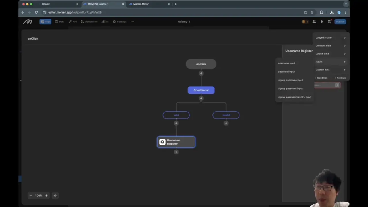
After successful signup, hide the signup modal and return to the main page.
Connecting Login and Signup Modals
Ensure that when switching between login and signup modals, the previous modal is hidden to avoid UI overlap.
For example, when a user clicks "Sign up" on the login modal, hide the login modal and show the signup modal.
Handling User State and Logout
Manage the logged-in state with a conditional view that updates the top bar content dynamically:
If the user is logged in (e.g., logged in user ID is not null), show the username and logout button.
If not logged in, show the login button.
The logout button triggers a logout action and hides user-specific UI, returning to the login state.
Summary
In this tutorial, you learned how to:
Analyze webpage layout using Chrome developer tools to understand spatial structure.
Create a responsive top bar using views and Flexbox layout with fixed positioning.
Implement conditional views to toggle login/logout UI based on user state.
Build custom login and signup modal dialogs with input validation and user feedback.
Manage user authentication states and switch between login and signup modals smoothly.
By following these steps, you can replicate a clean and functional navigation bar with authentication for your own web app using Momen.
FAQ
What is the purpose of using a fixed position for the top bar?
Fixed positioning keeps the top bar visible at the top of the viewport even when the user scrolls down the page, improving navigation accessibility.
Why use an inner container with max width inside the top bar?
The inner container prevents the content from stretching too wide on large screens and adds padding to keep content from touching screen edges, improving readability and aesthetics.
What is a conditional view and why is it used for login/logout?
A conditional view displays different UI elements based on conditions, such as whether a user is logged in or not. This allows dynamic switching between login and logout interfaces.
How do I validate user input in the signup modal?
Use a conditional view with conditions that check if username and password fields are not empty, passwords match, and password length meets minimum requirements before allowing signup.
How can I make sure the password input is secure?
Set the input type to "password" so characters are masked as the user types, protecting sensitive information from being seen on screen.
How do I switch between login and signup modals smoothly?
When opening one modal, hide the other to prevent overlapping UI and confusion. This can be handled by triggering hide actions on the current modal before showing the other.
What happens if login fails?
If login fails, show a toast notification informing the user that the login attempt was unsuchttps://www.youtube.com/embed/5sgzFbcP27Ucessful, prompting them to check their credentials.